Tuesday, May 31, 2016

Learning to Understand What You See

I had an aha! moment in my art journey recently. I was watching a video tutorial by Sycra, an illustrator who posts art instruction videos on YouTube. Sycra was describing the difference between drawing what you see and understanding what you see.


If you asked me if I knew that in order to create the illusion of a 3D form on flat paper that I had to be able to visualize the simplified 3D forms that make up that object, I would have nodded. Yes, of course I know that! 

Here's the aha! moment: I may have already known that, but it was while I was watching Sycra's video that I realized most of the time I wasn't actually doing it.

I dream up paintings and art pieces in my head all the time. Lack of ideas hasn't been the problem, lately. When I'm out in the world and struck by the way the morning light hits a tree or the way intricate shadows play on the sidewalk, everything has potential.

In my post on focused practice, I mentioned the struggle to get the beautiful scenes in my head or in front of my eyes out of imaginings and into physical reality in such a way that captures the moment and compels an emotional response in the people who see it.

Sometimes drawing what I want to draw the way I want to draw it gets overwhelming for me. You've heard the old adage: Stop and smell the roses.  Part of learning to see like an artist is really just taking the time to:


Stop and see the roses.

A red rose in bloom on the bush is not just red, it's also neon orange where the hot sun hits it, a translucent magenta where the light passes through the petals, and an inky merlot in the deep shadows where the petals meet and when it begins to wither and fade. There is a branching, almost fractal quality to the veining of each petal that is simultaneously a feat of engineering and the pulpy evidence of the biology of life. New abstract shapes are created in shadow every hour as the sun moves across the sky.


collage photo of red roses on a sunny day
garden roses
Julie Bazuzi (c)2016
When you really stop and see the roses, there is so much to see. So many shapes, so many colors, so much detail. 

It's too complicated. It's too hard. Where would I even start? I tip straight into the Land of Overwhelm and that impulse to reach for my sketchbook gets squashed before my hand even gets the message to start moving.


Oops, there's that inner critic again.


OK, so some good news: I noticed that inner critic voice showing up. No really, noticing that is what's happening is much better than just listening to those doubts and fears and giving up before I've even begun, right? 

Why? Because now that I've noticed, I have the power to make a choice. I can listen to that voice or I can listen to a different one, one that gives reassurance and encouragement instead. Sometimes I call this alternate voice my inner goddess of infinite compassion, but here let's call her our inner coach for short.


Alright inner coach, I'm ready for my pre-game pep talk!


Okay, when overwhelmed with uncertainty let's backtrack to what we know. I know that:

  • Drawing is a skill.
  • Skills are learned through study and improved through practice.
  • To draw what I see I need to understand what I see.
  • I need to simplify this complexity into generalized 3D forms.
  • After I understand what I see, I can add the detail later.

Here's my reference photo and my practice sketch. I started with a few overlapping circles and a small spiral at the center before feeling out the large shapes. I eliminated some of the innermost petals to simplify the flower. I used contour lines to force me to focus on the 3D forms of petal, leaf, stem, and bud. I indicated the direction of my light source to help me focus on what parts of the forms were facing the light and which were turned away or in shadow.

This is just stage one. It's not a finished drawing, but I do feel more confident! Stay tuned for stage two where I take this understanding and begin to add the details to bring these roses to life.


collage photo of rose next to a basic sketch of a rose on paper
work in progress: roses
Julie Bazuzi (c)2016


Saturday, May 28, 2016

The Diva's Weekly Challenge #269: Ellish

All this week I've been working on a post about drawing and seeing like an artist. All week! I think realistically it may need to be a two-parter or even a series of posts.

So, in the meantime I will offer you a little something I've been cooking up on the side for The Diva's Weekly Challenge #269: Ellish.


round abstract ink drawing using zentangle
Spiral-ish
Julie Bazuzi (c)2016
One of my children helped me name this one, combining the tangle name "Ellish" with the spiral effect happening as I arranged them radially. I think this tangle looks wonderful when combined with others, but I also really enjoy it on it's own like this. Lots of room for me to work on visualizing the levels and shading to add depth.

Saturday, May 21, 2016

Gaining Confidence through Accessible Art Practices -- Focused Practice

I have big ambitions when it comes to my personal growth as an artist. I've mentioned before, that I have my own definition of artist:
artist  /ˈärtist/  noun:  anyone who yearns to express thought-idea-emotion in a passionate, intuitive, or even spiritual way
But sometimes there's a chasm between visualizing that thought-idea-emotion and bringing it to life on paper in a way that captures the moment and compels an emotional response in the people who see it.


One thing that bridges that chasm is skill. And the only way to build that bridge is to practice.

I think the first time I truly understood that drawing was a skill that almost anyone can learn, was when I came across the book You Can Draw in 30 Days by Mark Kistler.


picture of cover for Mark Kistler's book You Can Draw in 30 Days

Kistler doesn't just tell you it's possible, he shows you through many examples of student work. Real people who thought they didn't have "the gift" or "the knack" for drawing discovered for themselves that drawing is a discipline (a branch of knowledge or a field of study), not a talent.

I try to carve out time for focused practice every day.

Some days that means spending time getting to know my materials better. Recently I went through my box of 48 colored pencils and I created swatches of each color to determine how they related to each other. Which could be used together to successfully create shading and highlights? Which could be used together in a gradual progression from light to dark? Where does each fit on the color wheel?


swatches of colors in Prismacolor 48 colored pencil setswatches of colors in Prismacolor 48 colored pencil set arranged in color wheel

They aren't pretty, and they don't need to be. You can even see where I was practicing some strokes with my Pigma Micron brush pen alongside my color swatches.

No one but you needs to see your focused practice unless you want them to. Their only job is to help you make progress in your pursuit of improving your skills. Over time, those improvements will show in your work and in your creative confidence. I feel more confident when I reach for my colored pencils now because I spent time getting to know the colors I have available to me and how they will work together.

Challenges and prompts are another way to approach focused practice. The constraints of the challenges themselves already create a focus. There are many places on the web where you can find weekly prompts for whatever kind of artwork you want to develop, from drawing to photography, journaling to Zentangle®.

For example, It's a String Thing Challenge #145 prompts us to create a small, square drawing using only the two tangles Skye and Antidots in a diagonally striped composition. These narrow limits invite us to really look more closely at what opportunities are available. How can I create variety when I have only two patterns? How many different ways can I use the composition to my advantage? If everyone has the same constraints, how can I make my tile unique?

Lately I've been practicing my shading techniques to take flat, 2D shapes and turn them into dimensional, 3D forms. I've been getting more and more comfortable with the techniques of where to add shading and how to blend the graphite, but there was one technique I'd been avoiding: cast shadows.

According to CreativeGlossery.com:
A cast shadow is a type of shadow that is created on a form next to a surface that is turned away from the source of light.  When a form blocks the light, it causes a cast shadow to be formed.  Every object that blocks light has a cast shadow associated with it.
I saw the intricate pattern for Skye in this weeks challenge and I knew it was time for me to get over my resistance. It was time for me to apply some focused practice . There's no other way to actually improve my skills if I never try it.

Here's my line art, before I began shading.


abstract ink drawing with Celtic-inspired knotwork
work in progress
Julie Bazuzi (c)2016
Next I added more contrast with ink and graphite and added some shading for dimension. Finally I braved the fearsome unknowns of cast shadows!

Don't worry, I managed to emerge the other side unscathed. Are they perfect? Nope. I know just enough about what they should look like to see what I can work on the next time I practice. But I overcame my resistance and I lived to art another day. I reminded myself that it's just a skill, and it's one I am confident I can learn. That's two thumbs up for me.


abstract ink and graphite drawing with Celtic-inspired knotwork
Spéir Scáth
ink, graphite on paper
Julie Bazuzi (c)2016
Remember, no one but you needs to see your focused practice unless you want them to. Though I will continue to post mine here for you in hopes that you can get some inspiration for your own growth as artists!

Update 5/31/2016: Just a few days after I posted this tile for It's a String Thing #145, the Diva posted Challenge #270 with an emphasis on the new tangle Skye as well!

Skye is a new tangle from Certified Zentangle Teacher (CZT) Margaret Bremner, who is well worth checking out!

Wednesday, May 18, 2016

The Diva's Weekly Challenge #268: "A bit-o-black"

This week the Diva's Weekly Challenge is about creating more drama by adding more black than you normally would. I love challenges that push me out of my comfort zone. Those so often become my favorites works!


abstract black and white ink drawing with orange colored pencil gems using zentangle, tangle, nebel
Nebel with Gems
ink, colored pencil on paper
Julie Bazuzi (c)2016
This tangle started life as a few practice strokes on a scrap of paper and then miraculously evolved into a piece I really loved creating. This reminds me of some advice I picked up from an interview with painter Robert Burridge:


Always use good materials 
because you just never know when 
a great piece of art will appear!

He talks about using high quality paper even in his sketchbooks from 5:58 to roughly 7:55 if you want to skip right to it, but the whole interview is pretty interesting if you want to learn more about how a prolific artist generates and keeps track of ideas. He also shares his art-making knowledge very generously, which is how I first encountered his work.

The belief in using quality materials as a way of showing respect to your creative journey is also part of the Zentangle® philosophy, which is why the kits and accessories come with archival ink pens and tiles made of such fine paper.

I love, love, LOVE art supplies. I want to try everything when it comes to art. (Why, yes I did pin those DIY instructions for making a kiln in my backyard, thank you very much!) When I go into the art supply store, I want two of everything. And when I get a sale catalog from Utrecht in my mailbox, hold me back!

But sometimes I find it a challenge to justify spending the money on the good stuff when it comes to my art addiction, despite how passionate I am about learning more about making art and how good I feel when I've spent time doing it.

That's the inner critic showing up again.

And while I do need to pay attention to my budget, I also need to protect and nurture my creative spark if I want it to keep growing. So take that, inner critic! (insert karate chop here) I'm very glad that even though I was just experimenting on a "scrap" I was still using the best materials I currently have, and I love what I created.


Strathmore colored pencil sketchbook with Prismacolor 48 colored pencil set and Sakura Pigma Micron pen
Julie Bazuzi (c)2016


Monday, May 16, 2016

Siren Call

I know the idea of getting sucked into Pinterest is probably familiar to many of you, and I am not immune. I can spend hours browsing art in all kinds of media.

You know when you see a painting or a photograph and it feels like everything else in the world just stops for a moment? That lurch of emotion, that swoon if you will -- whether the piece inspires awe, pleasure, tranquility, curiosity, passion, rapture, or alarm, heartbreak, anger, grief -- is amazing to me.


It's a little like love at first sight.

And if you're like me, that lurch is followed by a dreamy, meditative state of wondering.

encaustic mixed media collage painting with portrait drawing, cloth, and shellac burn effect
Lost in Thought
encaustic collage on wood panel
12" x 12"
Julie Bazuzi (c)2016

"How did they get that texture?"
"What materials did they use?"
"How did they attach this piece to that piece?"
And finally, "I need to try that!"

There it is again. The siren call. And I'm itching to get back to my sketchbook, my pens, my paints.

I've started a Pinterest board for art that I love and art that influences the way I create and wish to create my own art. It's eclectic in media, ranging from painting to pottery to quilt to stained glass.


I've noticed that while graphic black and white dominates my Patterns and Tangles boardmy Art and Influences board definitely shows how much I am also drawn to color. This is so true of my own art explorations as well.


black and white illustration of calla lillies in ink on paper
Zen Lillies
ink on paper
Julie Bazuzi (c)2016


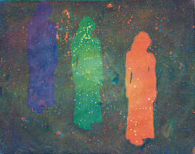
print of multiple abstract figures using gelatin monoprinting technique with acrylic paint
Echo
acrylic monoprint on paper
Julie Bazuzi (c)2016
Sometimes I come across an image that I love or that moves me and I want to do more than just bookmark it. I need to write about it and share it here, in hopes that maybe one more person will get a chance to feel something momentous just from seeing it too.

That happened one morning when I found the website for artist Oriol Angrill Jorda. In the Blendscapes series, the artist uses watercolor, graphite, and colored pencil to merge more than one subject and create something fantastic and magical. 

For example, in Scarf of Cloud, Jorda creates an incredibly beautiful and surreal  portrait of a woman where jagged mountains become her shoulders and the filmy clouds hovering around the peaks become a diaphanous scarf.


I am especially intrigued by the blend of portraiture and landscape into an image that dissolves the perception of being separate from the land we inhabit.

We are not just of this earth, we and this earth are one. We are not separate. My breath was your breath was made by that tree. The salts and minerals in my body are from those mountains, that sea, this rain. Tomorrow they will be in your body, or part of a raven, or in an apple. I want to embrace this connectedness in my life and I hope that one day I will be able to convey it in my own art.

Friday, May 13, 2016

The Diva's Weekly Challenge #276: "DuoTangle - Poke Root vs. Drupe"

In my last post I talked about gaining creative confidence through the versatile and accessible artform of Zentangle®. Though this is not the only form of art I'm actively producing, I'll probably post a lot about this topic simply because it was so instrumental in getting me back into making art after so long away.

There is a large online community around Zentangle and Zentangle Inspired Art (ZIA), with blogs and challenges and even Facebook groups dedicated to the practice. One blog that's been around for several years is I am the diva which is run by a Certified Zentangle Teacher (CZT®) and home of the ORIGINAL Zentangle Weekly Challenge.

The weekly challenges provide some inspiration and direction while also offering a way to connect with others and share your creations. This week I am the Diva posted Weekly Challenge #276: "DuoTangle - Poke Root vs. Drupe".
black and white abstract drawing using zentangle method and drupe tangle
drupe example
Julie Bazuzi (c)2016
black and white abstract drawing in ink on paper using zentangle, tangle, pokeroot
poke root example
Julie Bazuzi (c)2016

The Diva coined the term DuoTangle and in this week's post she explains that by placing the constraint of using only two tangles, it's an opportunity to discover how the two patterns relate to each other or even merge together to create something new.

I'd been exposed to this idea before, but this time I was really ready to receive it. Learning is like that. You can revisit a topic many times throughout your life and learn something new every time.

First I practiced the two tangles individually and experimented with creating variety of ways of drawing each pattern. I used a pencil because the smooth, almost effortless glide across the page frees my mind up to focus on shape, line, repetition, and variation.


a sketchbook with pencil drawings of drupe and pokeroot tangles using zentangle method
initial sketchbook tangle practice
Julie Bazuzi (c)2016
As I experimented, I began to see ways to integrate the two tangles and played with those ideas until I found something I really liked. I repeated this new interaction until I could draw it smoothly and comfortably, remembering to keep the zen in Zentangle!

Next it was time to ink the tile. I'm using a 6" x 6" sketchbook with paper that has a good thickness and tooth to it. This photo shows the line art before shading.


black and white abstract fantasy botanical drawing in ink on paper using tangles drupe and pokeroot in zentangle style
work in progress
ink on paper
Julie Bazuzi (c)2016
Next comes the shading. I used three different graphite pencils (2H, HB, and 4B) a white vinyl eraser, and a blending stump to get all the nuances of the shading and shadows.

You can see the way I wrapped the drupe tangle around the roundness of the poke root, elongated stems, and added more drupe at the base. In the end this DuoTangle reminds me of a clover plant in bloom, so I have named it Cloverly.

Here is the finished piece after the all final touches have been added!


black and white abstract fantasy botanical drawing in ink and graphite on paper using tangles drupe and pokeroot in zentangle style
Cloverly
ink, graphite on paper
Julie Bazuzi (c)2016

Thursday, May 12, 2016

Gaining Confidence through Accessible Art Practices -- The Zentangle Method

As a kid, I wrote stories and poems, I took dance classes, guitar lessons, and looked forward to art class with glee. I even had some minor recognition for my talents at times. At 8 years old, I was the youngest student from my school to be selected for a district-wide student writers workshop. At 10, my art teacher singled me out to take an advanced art class for youth at the local university. By the time I was "graduating" from elementary school, my teachers were signing my yearbook with things like, "I can't wait to read your first novel!" In high school I was encouraged to apply for (and then won) a competitive spot for creative writing in a summer boarding program for fine arts.

The thing is, at the time I never felt like I really lived up to the expectations of those enthusiastic and encouraging adults. Or rather, I never really lived up to the expectations I created for myself in the wake of their enthusiasm and encouragement. 

When on-the-spot creativity was required (You have 15 minutes to write a dialogue between two characters of your own creation which other students in class will perform, starting... now!) I blanked completely. 

And being a very sensitive soul, every perceived lack in my achievements became magnified into enormous failures. It was a self-reinforcing cycle. 


I lost my artistic confidence 
and I gave up creative writing and fine art 
for a long, long time.

Time passed, as it does.

There was college, and marriage, a career, and children. I became a graduate, a software tester, a mother, a homeschooler. But in that time, I never became an artist.

As I watched my children follow their curiosity and their hearts, learn to walk, talk, draw, write, swim, ride bikes, I cherished their fearlessness.

I began to grieve some of those lost opportunities from my own youth. I considered those artistic paths I hadn't followed out of loss of confidence, a fear of failure, and I wondered...


what if?

Enter Zentangle®, stage left.


black and white abstract drawing with color gems in ink on paper using diva dance and finery tangles in zentangle style
Early Gems
Julie Bazuzi (c)2016


Much has been written about the Zentangle artform, and I encourage you start at the source and read directly about The Zentangle Method, from the creators Maria Thomas and Rick Roberts.

The thing that drew me in, not just to admire the finished artworks created by others but to actually try it myself, was the philosophy:

Anything is possible, one stroke at a time.
- Rick Roberts & Maria Thomas

Incredibly ornate and intricate pieces of Zentangle art are created by deconstructing patterns into bite-size pieces. By distilling these patterns or "tangles" into simple, focused, and repetitive strokes, almost anyone can access not only this artform but also a soothing meditative state of mind.

Immediately I dug out an old sketchbook, previously abandoned for several years, and began filling pages the with tangles. I learned tangles from the Zentangle website and online communities generously sharing the step-outs to patterns they had learned directly from Rick and Maria, from each other, or created themselves.

sketchbook with black and whhite abstract drawing, patterns, tangles in zentangle style
sketchbook tangle practice
Julie Bazuzi (c)2016

You may have noticed that tangles are done in pen. That's right, because there are no erasers in The Zentangle Method. Why?


~ there are no mistakes ~


There are no mistakes because there are no pre-determined outcomes in this approach, only opportunities for new exploration. If your line wiggles, breaks, or heads off course, that is your stamp of authenticity. 


HERE LIES
original one of a kind artwork
that could only be made by 
YOU

If a "stray" line or dot appears, perhaps it's an invitation to add stippling, thicken the line weight, or add shading. One unintended or wiggly line can seem like a mistake when our inner critic starts talking. Repeated over and over again, that wiggly line is a unique rendering that takes on a life of it's own.


Just stop for a second and let yourself appreciate 
how freeing that idea is.


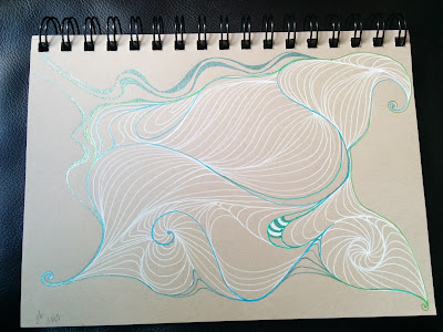
tan sketchbook paper with abstract drawing in white and metallic gel pen using auras in the zentangle style
Wild Auras
Julie Bazuzi (c) 2016


The Zentangle® Method is an easy-to-learn, relaxing, and fun way to create beautiful images by drawing structured patterns. It was created by Rick Roberts and Maria Thomas. "Zentangle" is a registered trademark of Zentangle, Inc. Learn more at zentangle.com

Monday, May 9, 2016

Welcome to PurposeWorks Studio

PurposeWorks Studio is home to my original works of visual art. It is also a landing place for my thoughts about art, writing, dance, connection, community, and service. This blog is a reflection on my personal growth as an artist, the way I define it.


artist  /ˈärtist/  noun:  anyone who yearns to express thought-idea-emotion in a passionate, intuitive, or even spiritual way

I start with the belief that each of us is born with an innate ability to express ourselves creatively even before we are verbal. The baby experiments with vocalizations; the toddler scribbles with gusto and instinctively sways to music; children imitate and act-out their imaginings. 

These expressions are biological imperatives.

Yet as adults - responsible grown-ups with lives that are serious business - so often these imperatives are tamped down, well-hidden, and long-forgotten. It can take effort to get out of our own way, to let that yearning drive for a while. But the result is that, for one moment or many, we show up as our unique, precious, and divine selves.

So welcome to PurposeWorks Studio, a place where I will show up, give way, and heed the siren call.


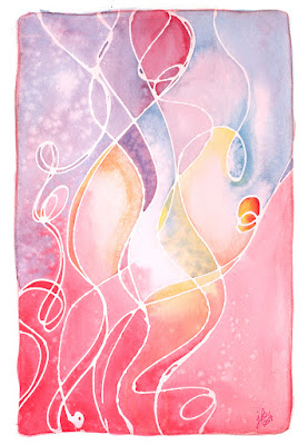
painting of abstract expressionist figure in red, pink, and blue watercolor
Maya
watercolor on paper
Julie Bazuzi (c)2016


when you hear the siren call
but fear forbids you from following,
there you find
your purpose

and once so seeing,
before you stretches
the freedom
to forge ahead