Saturday, June 25, 2016

Learning to Think Like an Artist

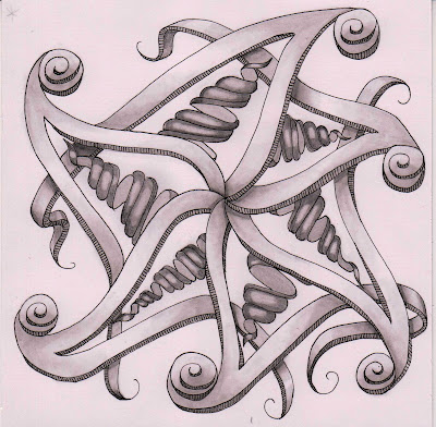
This week the Diva told us how she accidentally picked up a red pen in the middle of creating a black and white Zentangle tile. She challenged herself to push past her first reaction of "It's ruined!" and to keep going to see what would happen. Allowing herself that freedom of exploration, she ended up creating one of her favorite tiles.

From that grew Diva Challenge #272, where we are asked to add some red to the traditional black and white motif, to have fun, and to leave some room for exploration.

I started my tile this week by exploring a new to me technique for shading using hatching strokes with my ink pen. I used a very smooth bristol paper for this tile, which really let my pen flow over the paper with a minimum of drag. Delicious!

abstract black and white ink drawing in progress twisty towers and seed pods
work in progress
Julie Bazuzi (c)2016
Next I added some graphite shading, which is a whole new experience on such a smooth paper. The first layer of 2H graphite went down so smooth and buttery it felt like cheating! 

But after that I struggled a bit with my HB layer. I am used to having much more tooth to the paper. There is a learning curve, to be sure. But I followed the Diva's example, and I kept going to see what would happen. Then lastly, it was time to add that pop of red. Wow!


abstract red black and white ink and graphite drawing of twisty towers and seed pods
Groovy, Narwhal, Inapod, Ruutzfor Diva Challenge #272
Julie Bazuzi (c)2016
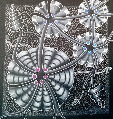
I wanted to keep up this spirit of exploration when I was working on my tile for the It's a String Thing Zensquicentennial Challenge, so I picked up that coal black drawing paper and my white gel pen and headed back into unfamiliar territory. I can see myself making progress with each new pancake!


abstract floral in white ink on black background
IZA, Teenos, and Uncorked
for It's a String Thing Zensquicentennial Challenge
Julie Bazuzi (c)2016
We've all heard people talk about the power of positive thinking and keeping an open mind. When the Diva resisted that first reaction to the accidental addition of red into her black and white tile, she made a conscious choice to keep going and see what would happen. She was thinking like an artist.

I like this list from the Amphitheater Art Instructors' Blog about learning to think like an artist:


I think the ideas on this list can be applied to so many parts of our lives, not just when we sit down to draw or paint. So the next time you take on a challenge, will you think like an artist?

Monday, June 20, 2016

Artist Burn Out and Loosening Up

This blog is primarily about my journey to learn art-making in adulthood and I've talked  a bit about using focused practice to build skills. But what do you do when focus seems impossible and practice sounds tedious and boring?

What happens when you burn out?


I was just chatting online with a fellow artsy friend who was feeling down and uninspired. She was still drawing and keeping up with group art challenges, but it felt like a slog. She didn't like the way her work was turning out, though the rest of the group saw wonderful passages in every piece and a new fluency overall in her technique.

I could absolutely relate. I've been there. SO many times.

As zen as Zentangle can be, the intense, up-close focus on tiny, tight, little details can get mentally wearing.

small intricate abstract Zentangle drawings with Micron pen for size
Two small drawings less than 5 inches square, with fineliner Micron pen for size.
We spend so much of our lives focused on the space right in front of us, heads tipped down, shoulders drawn forward and in, chest closed, breathing shallow as we drive, use our phones, read a book, work on our computers, chop veggies and cook...

Even the way we hold our pencil when we write -- close to the tip, upright, almost entirely controlled by fingers and wrist. And it's more of the same when we use technical drawing pens like the Pigma Microns for Zentangle.


Upright hand position, close to nib, for using technical drawing pens.
Upright hand position, close to nib, used for drawing with technical pens.
Our bodies need moments and movements of expansion to counteract all that time spent in contraction. Our bodies and our brains need us to look up, gaze at far off objects, open arms wide, and take deep, full breaths that re-light the fire in the belly. 

Our art needs the moments of expressiveness that come from larger arm movements using elbow and shoulder. It needs us to step back from the paper or canvas for a wider perspective on ourselves and our world. 

And it doesn't hurt that our art benefits from the cross-body movements that activate more of our brains. In fact, according to artist and educator Dan Nelson, the part of your brain that controls your arm is a better artist than the part that controls your fingers.

So when I'm feeling sluggish and uninspired, when focus seems unattainable, or when the brain fog sets in from being in the highly focused zone of minute detail for too long:


I need to stand up, 
get out juicy color and fat brushes, 
use larger arm movements, 
and loosen up for a while.

One of my favorite contemporary painters, Robert Burridge, talks a lot about loosening up in painting and letting the art viewer see just how much fun it is to be an artist. In fact, he has entire books and DVDs on loosening up as a painter.

So if you're feeling burned out, shift your body to shift your outlook. Stand up, throw your arms out wide, lift your eyes, and breathe deeply. Try something different and make it about play, about experimentation, about adventure, and looking outward, and discovery.


Make art with your whole body.

painting work table with an array of paints and work in progress
Painting work table with an array of paints and a work in progress.
teapot and two cups in blue and green
Tea for Two #1
acrylic on paper
Julie Bazuzi (c)2016

Sunday, June 19, 2016

Rainbow Flags and Beads of Courage

My heart has been heavy this week after the tragedy in Orlando, Florida. Many people I hold dear identify as LGBTQ including my oldest child, and I stand in solidarity with this community.


love knows no limits

LGBTQ Pride rainbow heart

This week, the Diva's Challenge #271 focuses on Beads of Courage, which she tells us is "an arts in medicine program that helps kids with chronic or life threatening illness tell the story of their medical journey."

This program is a bright spot of positivity for these kids and thinking about it helped me remember the kindnesses we humans are capable of creating, even in the darkest times.

Here's my tile with color using the "hefty hack" and the linework before shading. It seemed fitting to keep with the rainbow theme.


Beads of Courage Zentangle Inspired Artwork
Beads of Courage, a Zentangle Inspired Artwork
ink and watercolor

I added the color using watercolor markers from Letraset for the color and did some subtle shading with a set of gray Koi watercolor brush pens.


Beads of Courage Zentangle Inspired Artwork
Julie Bazuzi (c)2016

Saturday, June 11, 2016

Mihaly Csikszentmihalyi: Flow, the secret to happiness

Just a quick post tonight for It's a String Thing Challenge #148. I'm using a Strathmore Bristol Drawing Pad for the first time. It's very smooth and quite a bright white, so it marks quite a change from my usual materials which are usually more textured and more of off-white or ecru color.

I enjoyed exploring Fengle in my sketchbook and brainstorming complementary patterns to pair with it. I chose Narwhal to fill the space where Fengle often has inner auras and I added a thickness to the Fengle arms. Here's my linework before shading.


black and white abstract ink drawing of 3D spirals and twists
linework for IAST Challenge 148
Fengle, Narwhal
Julie Bazuzi (c)2016

Next I started in with the shading and added Snailz to the orb shapes at the end of the Fengle arms.


black and white abstract ink drawing of shaded 3D spirals and twists
IAST Challenge 148 after shading
Fengle, Narwhal, Snailz
Julie Bazuzi (c)2016
I definitely like where this is going, but I think it needs something more. Maybe some cast shadows to ground it? Maybe some more patterning along the Fengle arms? Maybe more patterns drawn behind everything that's there already? I'm not sure, but I think I'll let this one sit for a bit and come back to it later with fresh eyes.

In the meantime, you might give a listen to this renowned Professor of Psychology, Mihaly Csikszentmihalyi, who has pioneered the current understanding of the relationship between creativity and happiness.


Friday, June 10, 2016

Elements of Art: 2D Shape to 3D Form

I've had a Strathmore Coal Black Drawing Pad in my stash for a while now and using it is a really different experience than drawing with dark mark-making tools (pen, graphite, charcoal) on white paper. Recently I tried my hand at tangling with white gel pen and white pastel pencil on this black paper as a way to overcome artist block and it worked.

But one drawing only gets me so far. That's just the first pancake. You know, the tester pancake that gets a little overdone on one side but is still gooey in the middle as you fine-tune the temperature of the griddle and the thickness of the batter. That first pancake is usually edible but it's far from the fluffy, golden brown flapjack you were envisioning.

If my goal is learning more, making better and more meaningful art, I can't stop there. I need to keep making more pancakes.

One way to dig deeper is to do some (kind! compassionate!) self-critique to assess how well I've been handling the elements of art and the principles of design. For this post I'll stick to the elements of art which are the visual building blocks used by an artist: line, shape, color, value, form, texture, space.


Up until recently, my approach to tangling on black paper relied heavily on the art elements of line, shape, value, and texture (through pattern).


whimsical combination of black and white abstract patterns
Abstract black and white drawing created through intuitive composition
and the 
meditative application of repeated line, shape, and pattern.
Julie Bazuzi (c)2016
Drawings like this one can be fun to create and interesting to look at because of the varied and complex patterns arranged in whimsical ways. I notice though, that it is missing the representation of dimension (form) and depth (space) that I've been learning to add with graphite shading to my drawings that start with a light background. Artist and instructor Eni Oken calls it "shading fearlessly" and her instructional materials and mentorship has influenced a huge improvement in my work.


drawing of sphere wrapped in ribbons on tile-patterned background
Drawing of a sphere wrapped in ribbons
on tile-patterned background.
Julie Bazuzi (c)2016

Unlike Zentangle, which relies heavily on outlines, classical drawing techniques use changes in value and negative space to indicate the edges of an object and to render the illusion of a 3D form, like this sphere.


high contrast 3D drawing of sphere  with bright light and dark shadows
High contrast drawing of a sphere showing a three-
dimensional form with bright light and dark shadows.

Julie Bazuzi (c)2016
So my challenge for myself over the next few weeks is to figure out how I can marry the two approaches together to create lively, three-dimensional drawings in the Zentangle style on dark paper. What are you going to challenge yourself to do art-wise this week?

My advice to myself, and to you, is to try something new and then try it again and again.


Make more pancakes!

Monday, June 6, 2016

Stop and See the Roses

This post is a continuation of a post where I wrote about learning to understand what you see by breaking down complex subjects into their simplest shapes and forms. Practicing this is helping me overcome feelings of overwhelm when I want to draw more realistically or tackle complicated scenes.

I started with a very generalized, simplified sketch from my reference photo, looking at the basic 2D shapes and beginning to indicate the contour lines on the bud, leaves, and petals.


Julie Bazuzi (c)2016 purposeworks.blogspot.com
work in progress: roses
Julie Bazuzi (c)2016
Next I focused on the elements of the roses in terms of simple 3D forms and did some practice sketching. I broke the rosebud down into a cone sitting on top of a half-sphere and the stem into another half-sphere on top of a cylinder. If this is all sounding easy so far, add +1 to your creative confidence stat.


Then I considered the overall shape of the rose in full bloom. I sketched a cross-section of what happens as the bud opens. I noticed that the overall shape could be simplified into another sphere and I indicated elliptical contour lines as hints about where petal edges would fall.


Now that I had gained some concrete understanding about what I was seeing, I could more confidently look at each petal without getting so overwhelmed by the abundance of detail. As I began my drawing I started from the outside with the simplest shapes (bud, stem, leaf) and the largest petals. I concentrated on the underlying 3D structures one by one as I worked in towards the center, applied shading, and added detail bit by bit.


I wish I had kept track of how many hours I spent on this drawing. I worked on it over the course of a week, a little bit here, a little bit there each day. And even with my strategies for breaking down the complexity into manageable pieces, I will definitely admit that I started to feel the eye strain as I really honed in on those myriad of ruffled center petals.

Here is the finished study.

Julie Bazuzi (c)2016 purposeworks.blogspot.com
Sunlit Rose
study in graphite on paper
Julie Bazuzi (c)2016

Saturday, June 4, 2016

Stuck? Mix it up!

I've posted before about the benefits of participating in group art challenges where the challenge constraints help you achieve focused practice. When my choices are limited to a subject or a style, I'm pushed to really consider how I can make something unique, how I can really make it mine, and how I can use the challenge as an opportunity to grow as an artist.

The main philosophy behind The Zentangle Method® is cultivating a calm, meditative state through the mindful repetition of simple shapes that build naturally into ornamental patterns.
there are no mistakes

There are no mistakes when drawing this way, only opportunities to witness what shows up, to accept each unexpected visitor that appears, and to allow these surprises to inform the process.

When I participate in a group art challenge like It's a String Thing Challenge #147I want to hold space for the mindful awareness that sees no mistakes, only opportunities. At the same time, I want to commit to pushing myself somewhere new with my art. 

I looked at the string. I looked at the tangles. My brain jumped immediately to an obvious "solution" to the puzzle of what should go whereAnd yet, I wasn't excited about it.

Worse than that, I was disconnected, bored. Maybe I should skip the challenge this week, I thought. I mean, I didn't want to just dial it in. That would be a waste of an opportunity and the time available to me to work on my art is too precious to me for that. But I didn't want to give up either. I felt stuck. I had artist block. Then I remembered:


resistance is a message

When we feel resistance to taking some action in our life, we are getting a message from our subconscious: Yield, Proceed With Caution. It can be a protective instinct, a warning, a fear of failure or being vulnerable, or even just a signal to pause, reflect, and connect with what you really need and want.

I realized that what I really needed was to flip the script for myself and try something that would take me more into the unknown.

Julie Bazuzi (c)2016 purposeworks.blogspot.com
drawing tools for black paper
Julie Bazuzi (c)2016
So I dug out my black drawing paper and my white pens and pencils. Suddenly a composition that wasn't inspiring me in predictable black ink on white paper felt like a whole new adventure. 

I still used the predetermined composition and patterns in pretty much the same way my brain originally devised, but by reversing the colors: I would have to use chalk instead of graphite, my value scale would go from dark to light instead of my usual light to dark, and I would have to think in terms of highlights instead of shadows.

Everything was inside out.

Time to experiment and see what happens. I felt connected to what I really wanted and need out of this art practice, and suddenly it was exciting again!


abstract flower, flower drawing, white gel pen, black paper
Reverse
mixed media on paper
Julie Bazuzi (c)2016